
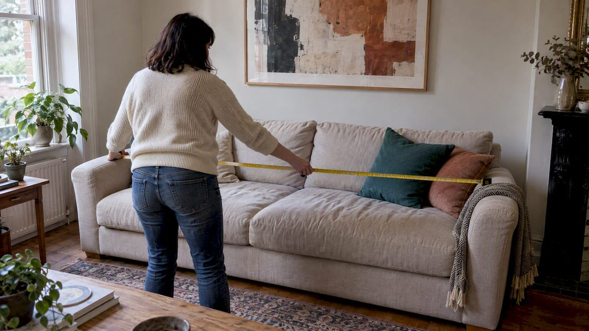
For most sofas, choose artwork that spans roughly 60% to 75% of the sofa’s width and hang the lower edge about 15 to 25 centimetres above the sofa back. That single calculation solves most proportion problems before they start. Tall ceilings, oversized sectionals and off-centre sofas need small adjustments, which we cover below, along with a printable measurement checklist you can use today.
TL;DR:
- Artwork should be roughly 60% to 75% of the sofa’s width and hung 15 to 25 centimeters above the back for balanced proportions.
- Larger sofas may require wider art or gallery walls, especially if ceilings are high or the sofa is a sectional longer than 2.4 meters.
- Art at eye level should be adjusted downward to about 6 to 10 inches above the sofa when viewed from seated positions.
- For long, low sofas, landscape-oriented art or gallery arrangements work best, with consistent spacing and anchoring a dominant piece.
- Warm-toned, earthy art complements the evolving 2026 color trend toward warm minimalism, especially when paired with neutrals and textured fabrics.
Table of Contents
- Size and proportion: how to calculate the right artwork width
- Placement and hanging height: eye level rules adjusted for seating
- Orientation and layout: one statement piece, a diptych, or a gallery wall
- Colour, palette and contrast: coordinating without matching
- Materials, texture and framing: finishes that suit your upholstery
- Practical measurement and hanging checklist you can use right away
- How our handpainted commissions put these rules into practice
- Choosing art style and theme to complement your sofa and room
- Selecting art based on sofa fabric and the room’s light
- Mixing art mediums above a sofa: canvas, prints and textiles
- Looking after artwork placed above a sofa
- Tips for buying art on a budget, from galleries to online prints
- Should the sofa or the art lead the room?
- Browse handpainted art or commission a piece sized to your wall
- FAQ
- Sources
Size and proportion: how to calculate the right artwork width
The two-thirds rule exists because a gap that is too wide leaves art looking lost, while art that is too narrow looks like an afterthought pinned above the cushions. The 60 to 75% guideline gives you a working range rather than one fixed number, so you can lean wider for a bold statement or narrower when the wall is already busy with shelving or a window.
Working through actual sofa widths makes the rule concrete:
- A smaller sofa suits appropriately sized artwork or groupings to keep visual balance.
- Larger sofas benefit from broader artwork or arrangements to complement their scale.
- Sectionals or very long sofas usually work best with multiple pieces or gallery walls rather than a single large canvas.
Ceiling height changes the calculation slightly. In a room with ceilings above 2.7 metres, push toward the upper end of the range or add height with a taller frame, otherwise the art reads as small against the volume of the room.
Sectionals and very long sofas rarely suit a single canvas once the width passes about 2.4 metres, because a piece that large becomes expensive and hard to source. A gallery wall or a stretched arrangement of two or three canvases spreads the same visual weight across the wall without needing one oversized piece, and it gives you flexibility to adjust the grouping later if you change the sofa.

Placement and hanging height: eye level rules adjusted for seating
The standard gallery guideline puts the centre of a piece of art at 57 to 60 inches from the floor, which assumes a viewer standing in front of it. Above a sofa, that number sits too high, because the people actually looking at the art are seated. The same source recommends hanging the lower edge roughly 6 to 10 inches above the sofa back as a more reliable starting point for seating areas, and adjusting the standard height downward whenever art is viewed primarily from a chair or sofa.
Pro Tip: Sit on the sofa before you commit to a hook position. The height that looks right standing up often looks too high once you’re seated.
A short sequence keeps the measuring simple:
- Measure the sofa’s width and mark its exact centre point on the wall behind it.
- Measure from the top of the sofa back to the floor, then add 15 to 25 centimetres to find your lower-edge target.
- Cut a kraft paper template the size of your chosen artwork and tape it to the wall to check the scale and height before drilling.
- Step back, sit down, and view the mock-up from the sofa itself, adjusting a few centimetres if the balance feels off.
- Mark the final hardware position only once the paper template looks right from both standing and seated positions.
Renters and anyone wary of wall damage have reliable options. Picture rails, museum putty and removable strip hooks all hold standard canvases without drilling, and our guide to hanging height includes templates for testing placement before committing to a fixing point.
Orientation and layout: one statement piece, a diptych, or a gallery wall
A long, low sofa generally suits a landscape-orientation piece, because the horizontal lines echo the furniture beneath it and keep the eye moving along the wall rather than up toward the ceiling. A narrower wall or a room with higher ceilings often works better with a tall, vertical piece, which draws the eye upward and makes the room feel less squat.
Diptychs and triptychs let you cover a wide sofa without sourcing one enormous canvas. Keep the gap between panels small and consistent, typically 2 to 5 centimetres, and align the tops or centres rather than mixing both, which reads as unplanned rather than deliberate.
A gallery wall needs one piece to do the anchoring. Hang the largest or most commanding work first, then build the smaller pieces around it rather than trying to balance several equal-sized works at once.
- Keep inner spacing between pieces consistent, commonly 5 to 10 centimetres.
- Leave a margin at each end roughly equal to the sofa’s arm width so the grouping reads as one object.
- Treat the whole arrangement as a single shape when checking it against the 60 to 75% width rule.
Our gallery wall styling guide walks through spacing templates in more detail if you’re arranging more than three pieces.
Colour, palette and contrast: coordinating without matching
Most designers advise against literal colour-matching between art and sofa, because an exact match tends to flatten a room rather than finish it. The more reliable approach is to let the art anchor a palette: pull one colour from the piece and repeat it in cushions or a throw, while letting the rest of the room stay neutral.
For 2026, living room palettes are shifting toward warm minimalism, with mocha brown, forest green and sage replacing the cooler greys that dominated previous years. This shift means art with warm undertones or earthy pigments tends to sit more comfortably above a sofa in these tones than art built around cool blues or stark monochrome.
A few practical tactics keep the room cohesive without forcing a match:
- Echo an undertone rather than a shade: a sofa with warm beige fabric pairs well with art that has gold or terracotta notes, even if no colour is identical.
- Use a bold, high-contrast piece to enliven a plain neutral sofa, and a quieter, tonal piece to avoid competing with a patterned or brightly coloured one.
- Layer neutrals around a strong artwork, such as a cream throw or pale cushions, so the piece has room to stand out rather than fighting the rest of the palette.
Contrast and tonal value matter as much as hue. A dark, saturated sofa needs art with enough tonal lift to register against it, while a pale sofa can carry darker, moodier art without the pairing feeling heavy. Our interior matching guide covers this tonal balancing in more depth.
Materials, texture and framing: finishes that suit your upholstery
An unframed canvas reads casually and softens a room, while a framed piece, especially in a substantial wood or metal frame, adds formality and works well against tailored upholstery like leather or structured linen.
- Wood frames suit boucle, wool and other textured fabrics, echoing their warmth.
- Metal or gilt frames pair naturally with velvet or smooth leather, adding a crisper contrast.
- Impasto or heavily textured canvases bring tactile interest that complements boucle or chunky knit upholstery.
- Smooth, glossy finishes or metallic inks sit better against sleek leather or plain cotton weaves.
Large windows and direct sunlight fade pigments over time, so rooms with strong natural light call for UV-resistant varnishes or placement away from the worst glare. Renters can still achieve a framed look without drilling by using adhesive strips rated for the frame’s weight or a leaning ledge display instead of a wall fixing, a solution covered in our living room wall decor guide.
Practical measurement and hanging checklist you can use right away
Once you have chosen a direction, the actual hanging process is short:
- Measure the sofa’s width and calculate your target artwork width at 60 to 75% of that figure.
- Find and mark the sofa’s centre point, then cut a kraft paper template to test scale directly on the wall.
- Decide whether to measure from the centre or use the lower-edge rule, then mark your hardware positions accordingly.
- Fit renter-friendly hanging hardware where needed, then sit down and adjust before finalising the position.
- Keep a tape measure, spirit level and paper template on hand before you start.
- Recheck the mock-up from a seated position, since standing-height judgements are often wrong for sofa art.
Our art selection checklist expands this into a longer framework if you’re furnishing an entire room rather than one wall.
How our handpainted commissions put these rules into practice
We work through these same proportion and placement calculations every time we take on a commission, because an awkward wall width or an unusual ceiling height is a common reason people come to us rather than buying an off-the-shelf print. Every piece we sell is hand-painted to order, with previews and unlimited revisions before anything ships.
- We size commissions to fit the sofa and wall requirements, rather than forcing a standard canvas size to fit.
- We offer previews before painting begins, so you can check proportion and colour against your own sofa and room.
- We support trade and larger commercial projects alongside private home commissions.
That flexibility matters most when a sofa sits in a non-standard spot, such as under a low window or beside a chimney breast, where a stock-sized print rarely fits cleanly.
Choosing art style and theme to complement your sofa and room
Style should follow the mood you want the room to carry, not the other way round. A mid-century sofa in a clean, tailored shape generally suits abstract or geometric art, since both share a sense of restraint, while a traditional roll-arm sofa in a classic fabric tends to sit more comfortably beneath a landscape or a softer, painterly piece.
Think about the room’s overall decor rather than the sofa in isolation. A minimal, pared-back living room can carry a single bold abstract work as its one strong gesture, while a room already layered with pattern and texture, cushions, rugs, curtains, often needs a quieter piece so the wall doesn’t compete with everything else. Matching theme to mood works better than matching theme to furniture style alone: a calm, muted landscape suits a room meant for reading and winding down, while a graphic, high-contrast abstract suits a more sociable, energetic space.
When in doubt, let the sofa’s formality guide the art’s formality. A casual linen sofa rarely suits a highly polished, hyperrealistic piece, and a sharp, structured leather sofa can look at odds with a loose, folk-art style canvas. Keeping those registers aligned is a quicker route to a cohesive room than hunting for an exact stylistic match.
Selecting art based on sofa fabric and the room’s light
Fabric texture changes how art reads above it. A boucle or wool sofa has its own visual texture, so a smooth, high-gloss print can look flat against it, while a textured or impasto canvas holds its own better in the same visual register. Leather and velvet, by contrast, are already smooth and reflective, which means they pair well with either a matte finish or a textured piece without competing for attention.
Light matters as much as fabric. A room with strong, direct sunlight through large windows washes out pale or low-contrast art during the brightest hours, so a piece with more saturated colour and tonal depth holds up better across the day. A north-facing room with cooler, more even light suits warmer-toned art well, since the warmth compensates for the room’s naturally cooler cast.
Dim rooms or those lit mainly by lamps in the evening benefit from art with some reflective quality, a varnished canvas or a touch of metallic ink, since matte, heavily textured pieces can disappear in low light. Checking how a piece looks at different times of day, not just under the shop’s or website’s lighting, prevents a mismatch once it’s on your wall.
Mixing art mediums above a sofa: canvas, prints and textiles
Combining mediums above a sofa works well as long as one quality stays consistent, usually colour palette or frame treatment, so the eye reads the grouping as deliberate rather than mismatched. A hand-painted canvas paired with a framed print can sit together comfortably if both share a similar tonal range, even though their surfaces differ.
Textiles, such as a small woven hanging or an embroidered panel, add dimension when mixed with flatter prints or canvases, and they bring a tactile quality that pairs particularly well with boucle or linen sofas. The key is restraint: mixing three or more distinct mediums in one small grouping above a sofa usually reads as cluttered rather than curated.
A simple approach is to let one piece, often the largest canvas, set the tone and treat everything else as support. A textile swatch or small print should echo a colour or texture already present in that anchor piece rather than introducing an entirely new palette. This keeps a mixed-medium arrangement from feeling like separate decisions rather than one considered display.
Looking after artwork placed above a sofa
Dust settles on frames and canvas surfaces over time, so a light dusting with a soft, dry cloth every few weeks keeps detail visible, particularly on textured or impasto pieces where dust collects in the raised areas. Avoid household cleaning sprays directly on canvas or paper, since many contain solvents that can damage pigment or varnish.

Sunlight is the bigger long-term risk for art hung above a sofa, especially in rooms with large south-facing windows. Direct, prolonged sun exposure fades pigments and can yellow varnish over years, so positioning art away from the strongest direct light, or using UV-filtering glass for framed paper works, protects colour over time.
Humidity also affects canvases and paper differently: a canvas can slacken slightly in damp conditions, while paper prints are more prone to cockling or foxing in persistently humid rooms. Checking a piece annually for any slack, warping or fading is a simple habit that keeps artwork looking as intended for years rather than fading unnoticed.
Tips for buying art on a budget, from galleries to online prints
Budget shapes where you shop more than taste does. Open-edition prints from online retailers are the most affordable route and suit renters or anyone testing a style before committing further, though they rarely offer the texture or individuality of an original piece. Local galleries and art fairs sit at the next tier, often with original works at a range of price points, and they let you see scale, texture and colour in person before buying.
Commissioned or made-to-order pieces, hand-painted to a specific size and palette, cost more than a stock print but solve the sizing problems that come with an unusual wall or an oversized sofa, since the piece is built to fit rather than chosen from whatever happens to be in stock. A room preview tool can help bridge the gap between browsing online and committing to a purchase, letting you see roughly how a piece will sit against your existing furniture before you buy.
Whichever route you choose, measuring first and shopping second avoids the most common budget mistake: buying a piece you love at a size that was never going to fit the wall.
Should the sofa or the art lead the room?
My own rule: the sofa sets the scale and the mood, and the art should answer it rather than compete with it. Chase a trend palette if it genuinely excites you, but choose the piece itself for whether you’ll still want to look at it in five years, not because a colour is fashionable this season.
— Lennard
Browse handpainted art or commission a piece sized to your wall
When a sofa is an awkward width, or you want a colour pulled directly from your cushions rather than approximated by a stock print, a made-to-size commission solves the problem a standard canvas can’t. We paint every piece to order, with previews and revisions before anything ships, so you can check scale and palette against your own room first.
Browse our handpainted masterpieces, or go straight to a category: abstract and modern abstract work well as statement pieces above a neutral sofa, while landscape pieces suit a calmer, classic room. For an unusual wall size or a specific colour brief, request a commission and we’ll size it to fit.
FAQ
What is the 2/3 rule for sofas?
The two-thirds rule suggests artwork above a sofa should span roughly 60% to 75% of the sofa’s width, so the art width varies depending on the sofa size. It keeps the grouping proportionate rather than lost against the furniture.
What are the sofa colour trends for 2026?
Living room palettes are moving toward warm minimalism for 2026, with mocha brown, forest green and sage replacing cooler greys. Choosing art with similar warm undertones helps a new sofa and existing art feel coordinated rather than mismatched.
What is the 70/30 rule in art?
This isn’t a standardised, widely recognised rule in the way the two-thirds sizing guideline is, and definitions vary depending on who’s using it.
What are some good colour combinations for a sofa?
Rather than matching a sofa’s colour exactly, most designers recommend echoing an undertone or pulling one accent colour from the art into cushions or a throw. Warm neutrals paired with earthy greens or browns are working particularly well with 2026’s palette shift toward warm minimalism.
How high should I hang art above my sofa?
A reliable starting point is hanging the lower edge of the artwork roughly 6 to 10 inches above the sofa back, which is lower than the standard 57 to 60 inch eye-level guideline used for standing viewers. Testing the height with a paper template while seated on the sofa confirms the right position before you drill.
Sources
- 17 living room wall decor ideas—From allover tile to aquatic accents—That add the perfect finishing touch | Architectural Digest
- How high should you hang wall art? A designer’s guide to perfect placement | J Jones Design Co
- Should your art match your sofa? | The Decorologist



Laat een reactie achter
Deze site wordt beschermd door hCaptcha en het privacybeleid en de servicevoorwaarden van hCaptcha zijn van toepassing.