
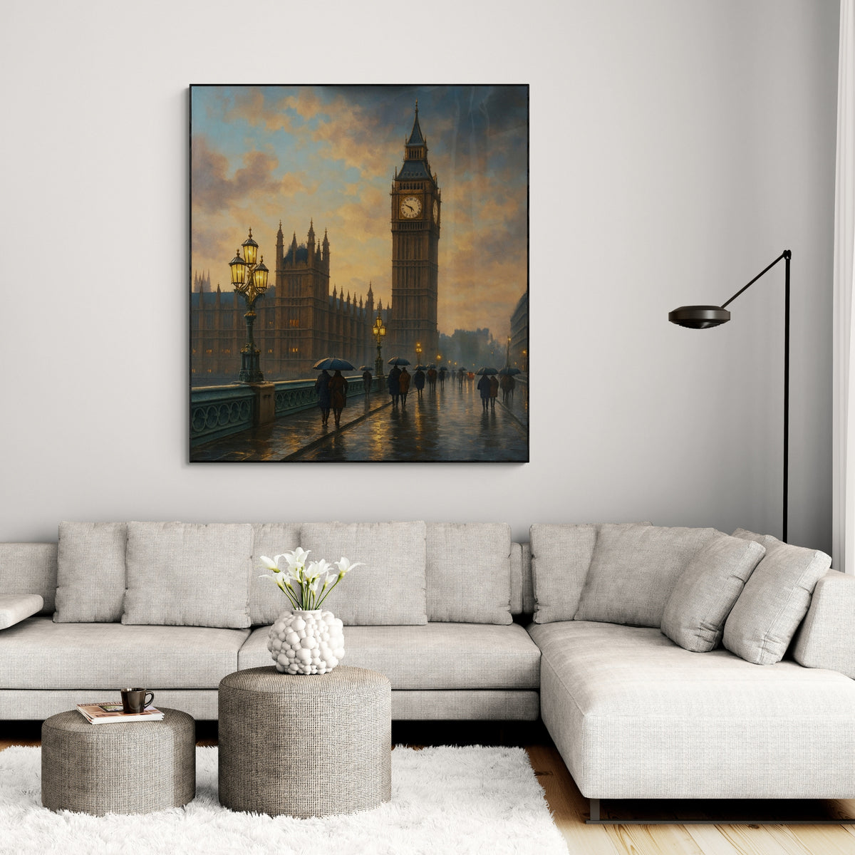

The best bedroom art is calm, sized to the furniture beneath it and chosen for how it feels at 10pm, not how it looks in a shop. That usually means one large soft abstract or landscape above the bed, a tidy pair or trio, or a layered shelf of smaller pieces. Below you will find twelve ideas, the sizing logic behind them, and a simple way to test a piece before you buy.
TL;DR
- Choose calm but not dull: soft abstracts, muted landscapes and botanical subjects suit a room built for winding down.
- Size matters more than subject. Our own bedroom guide works to a rule of 50 to 75% of the width of the furniture below the art.
- Ground small pieces with a bedside table, console or shelf so they do not look as if they are floating.
- Try pieces from elsewhere in your home first, in your bedroom’s evening light, before buying anything new.
- If nothing off the shelf fits your wall or palette, a hand-painted commission can be made to your size and colours.
Table of Contents
- What makes bedroom art different from living room art
- 12 bedroom wall art ideas
- How big should art above the bed be?
- Choosing colours and subjects that help you wind down
- Test before you buy
- Our perspective: why we paint bedrooms differently
- When a commission makes sense
- Common mistakes to avoid
- FAQ
- Sources
What makes bedroom art different from living room art
A living room is partly a stage. A bedroom is not. Designer Straub of Lndn Gray says bedroom pieces should feed the resident’s spirit and feel lived-in rather than staged for guests. Designers quoted in the same piece add that a bedroom needs a balance between personal meaning and a soothing look, because it is where you escape the day.
In practice that gives you three filters for every idea below:
- Energy. Avoid high-contrast, busy or jagged compositions above the place where you sleep.
- Light. Your bedroom is mostly used in lamplight or early morning grey. Judge art in those conditions.
- Meaning. One piece you actually love beats five you chose to fill space.
Calm does not have to mean boring. Livingetc quotes designer Tanya Selway of Stelly Selway on choosing calm but interesting pieces, with a tone that suits a room meant for sleep. Texture, a confident brushstroke or a surprising colour note inside a quiet palette all do that job.
12 bedroom wall art ideas
1. One large abstract above the bed
The simplest answer to a blank headboard wall is a single oversized piece. A soft abstract with tonal colour, such as oatmeal, clay, sage or dusty blue, gives the wall a focal point without demanding attention. Interior design commentary points to calming, abstract and nature-inspired subjects as the most effective for bedrooms, with muted tones and soft brushstrokes anchoring the room as a sanctuary.
Hand-painted work earns its place here. Layered paint catches lamplight and shifts through the day, which a flat print cannot do. Our abstract wall art collection and modern abstract collection are good starting points, and our guide to why abstract art suits homes explains why it works so well in private rooms.
2. A misty landscape
Distant hills, a lake at dawn, a tree line in fog. Landscapes create depth, and depth makes a wall feel further away, which is helpful in a small or box-shaped room. Keep the horizon low and the palette quiet. Our landscape collection has hand-painted options in this register.
3. A pair either side of the bed
Two matching pieces above each bedside table create symmetry, and symmetry reads as rest. This works well if your bed sits in an alcove, or if a single central piece would clash with a window or sloping ceiling. Keep the two pieces related in palette and frame rather than identical in subject.
4. A trio over the headboard
Julie Blanner suggests using one, two or even three pieces above the bed, as long as they share something in common. That might be a colour, a brushstroke style or a frame finish. A trio of verticals can also make a low ceiling feel higher.
5. Wabi-sabi texture
If you want the bedroom to feel earthy and unfussy, look for art that celebrates imperfection: heavy texture, uneven edges, plaster-like surfaces in neutral shades. It sits easily with linen bedding and natural wood. Our wabi-sabi wall art collection is hand-painted in exactly this spirit.
6. A mirror as a piece of sculpture
In a dim or compact bedroom, a mirror does two jobs. Designers quoted by Ideal Home recommend mirrors that bounce light and add lived-in charm, as long as they are used thoughtfully so they do not clutter the room’s energy. Place it where it reflects a window or a lamp, never directly opposite the bed if you find reflections unsettling at night. For more on brightening a tight room, see these small space decor ideas that lean on mirrors.
The pairing that works: a mirror on one wall, a soft painting on the wall you see from bed.

7. Coastal calm without the cliché
Soft blues, sea-glass greens and sandy neutrals suit bedrooms well. The risk is ending up with a beach-shop look. Keep the subject abstracted: horizon lines, tide-washed colour fields, a suggestion of surf. We cover this in our guide to coastal wall art ideas that avoid the cliché.
8. Leaning art on a dresser or nightstand
Renting, or just reluctant to drill? Havenly suggests leaning layered pieces on a nightstand or dresser for depth and richness without making holes. Mix sizes and textures, put the largest piece at the back, and let a smaller one overlap it.

9. A gallery wall that stays quiet
A gallery wall can be soothing if you give it rules. The Spruce shows a smaller grouping of pictures paired with larger abstract pieces for a layered look. In a bedroom, keep frames in one or two finishes, leave generous gaps, and let one large abstract anchor the arrangement. Put the busiest personal photos on a side wall, not above the pillows.
10. Small art on a big wall, grounded
A small piece alone on a large wall looks adrift. Tanya Selway’s advice in Livingetc is to ground small pieces with furniture such as a console or nightstand. A tall plant beside the piece also helps balance the composition; these statement indoor plant examples show how height and volume can offset a smaller frame.
11. Botanical and nature-led subjects
Leaves, grasses, blossom and soft florals bring a quiet organic note and sit well against white or grey walls. Pick painterly, low-contrast versions over crisp graphic ones if the room is small. Muted greens and chalky pinks are forgiving at night.
12. A commissioned piece pulled from your room
When your headboard fabric, curtains or paint colour are specific, ready-made art can feel almost right. A commission lets you match the palette and the exact dimensions of the wall. More on that below.
How big should art above the bed be?
Most bedroom art goes wrong on scale, not subject. A piece that is too small looks stranded above a wide bed. Our guide to making a UK bedroom calmer works to a sizing range of 50 to 75% of the width of the furniture beneath the art, alongside warm lighting and commissioning options. Use that range as your first filter.
A practical method:
- Measure the width of your headboard or bed.
- Multiply by 0.5 and by 0.75 to get your target width range.
- Cut paper or newspaper to that size and tape it to the wall.
- Leave it up for a few days and look at it from the bed, not from the doorway.
A grouping counts as one unit: measure the outer edges of the whole arrangement, not each frame. For very large walls and oversized pieces, our guide to styling large wall art goes further.
Keep the lowest edge of the art a hand’s width or so above the headboard so it does not feel crammed, and check that it will not be knocked by anyone sitting up against the pillows.
Choosing colours and subjects that help you wind down
The calmest bedroom palettes tend to stay within a narrow range. Think of the room as three or four colours in total, including bedding and walls, and pull the art from within them or choose one gentle accent.
| Room situation | Art direction | Why it works |
|---|---|---|
| Dim, north-facing room | Pale artwork with generous white space | Reflects what light there is |
| Cool grey walls | Warm neutrals, soft terracotta or ochre | Adds warmth without noise |
| Warm white or cream | Sage, dusty blue, slate | Gentle contrast, still restful |
| Dark painted walls | Light, textured abstract | Gives the eye somewhere to land |
| Lots of pattern in the textiles | Quiet tonal abstract | Avoids competing with bedding |
The first row echoes advice from a recent bedroom artwork guide about dim walls benefiting from reflective or pale pieces. Treat the table as a starting point: your own lamps and window direction matter more than any rule.
Test before you buy
Before spending anything, try pieces you already own. Julie Blanner describes the habit of shopping your own home: borrow a print from the hall or the living room, hang it in the bedroom for a week and see how it feels in the evening. It avoids buying art for the shop’s atmosphere rather than your own room’s lighting and mood.
While you test, ask yourself:
- Do I notice it when I lie down, and is that pleasant or tiring?
- Does it still look right with only the bedside lamps on?
- Would I be happy to see it first thing on a grey Monday?
If the answer to any of these is no, change the colour or the subject, not just the frame.
Our perspective: why we paint bedrooms differently
We started from a simple belief: the wall above your bed deserves a real painting, made by a real person. Every artwork we sell is hand-painted to order by artists, not mass-produced prints and not AI-generated images. In a bedroom, that matters more than anywhere else, because you see the piece in every kind of light and mood, and texture and layered colour hold up where flat reproduction goes dull.
The second belief is that nobody should have to guess. Because each piece is made to order, we offer previews and unlimited revisions before shipping. If the green is a shade too cold for your headboard, we adjust it. If the size is a little off, we correct it. Behind that sits a 100-day satisfaction guarantee and free returns, because a bedroom is a personal room and you should be sure.
Our advice for most bedrooms is short. Pick one large, quiet piece instead of many small ones. Match its palette to the room’s textiles. Size it generously. Then live with it in lamplight before you decide. Designers and homeowners alike tend to regret busy art in the bedroom far more often than plain art.
— Lennard
When a commission makes sense
Ready-made art is the right call for many rooms. A commission earns its place when:
- your wall is an unusual width, for example a long wall behind a super king bed or a narrow chimney breast alcove;
- your colour scheme is specific and nothing off the shelf quite matches;
- you are furnishing several bedrooms and want them to feel related but not identical, as in a rental development, boutique hotel or show home;
- you want a piece that reflects a place or memory without looking literal.
We work with private homeowners, interior designers and property developers. Browse the handpainted masterpieces on our homepage to see ready-to-order pieces, or ask for a custom size, style or colour palette. You will see a preview before anything ships, and trade clients can speak to us about larger projects.
Common mistakes to avoid
- Hanging too high. Art should relate to the headboard, not float near the ceiling.
- Choosing for the shop, not the room. Colours shift in lamplight. Test first.
- Too many competing focal points. One strong wall is enough: pair art with a mirror or plant rather than adding more art.
- Matching everything exactly. Pull one or two colours from your bedding and leave the rest to contrast gently.
- Ignoring the other walls. Art opposite the bed is what you see on waking, so give it as much thought as the headboard wall.
FAQ
What is the best wall art for a bedroom?
Soft abstracts, quiet landscapes and botanical subjects in muted tones are the safest and most restful choices. They suggest stillness rather than stimulating the eye, which helps in a room you use to wind down. Beyond that, choose something you love living with.
What size art should go above a bed?
Aim for a piece, or a grouped arrangement, that covers roughly half to three quarters of the width of the bed or headboard. Our bedroom guide uses a 50 to 75% range. Taping paper templates to the wall first is the easiest way to check.
Can I put art in a rented bedroom without drilling?
Yes. Lean layered pieces on a dresser, nightstand or shelf, with the largest at the back and smaller ones overlapping in front. Mixing sizes and textures gives the same depth as a hung arrangement without any holes.
Should bedroom art match the bedding?
It should relate to it, not copy it. Pull one or two colours from your textiles and let the rest of the piece stay in the same soft range. That keeps the room cohesive without looking staged.
Sources
- Bedroom wall art ideas, Livingetc
- Bedroom wall decor ideas, Ideal Home
- Bedroom wall decor ideas that interior designers swear by, Architectural Digest
- Art above bed, Julie Blanner
- 30 bedroom wall decor ideas from interior designers, Havenly
- 32 bedroom wall decor ideas, The Spruce


Leave a comment
This site is protected by hCaptcha and the hCaptcha Privacy Policy and Terms of Service apply.