

The most reliable way to make a bedroom feel calmer is to hang nature-led imagery, soft abstract washes, or minimalist line art, all chosen at the right scale and colour temperature. Before browsing anything, measure your wall width and pull the dominant colours from your bedding or curtains. Both ready-made collections and bespoke commissions are available if you want a piece matched exactly to your room.
TL;DR:
- Choose artwork with low contrast, minimal detail, and subdued colours such as soft landscapes, botanical single-stems, or muted abstracts for maximum calming effect.
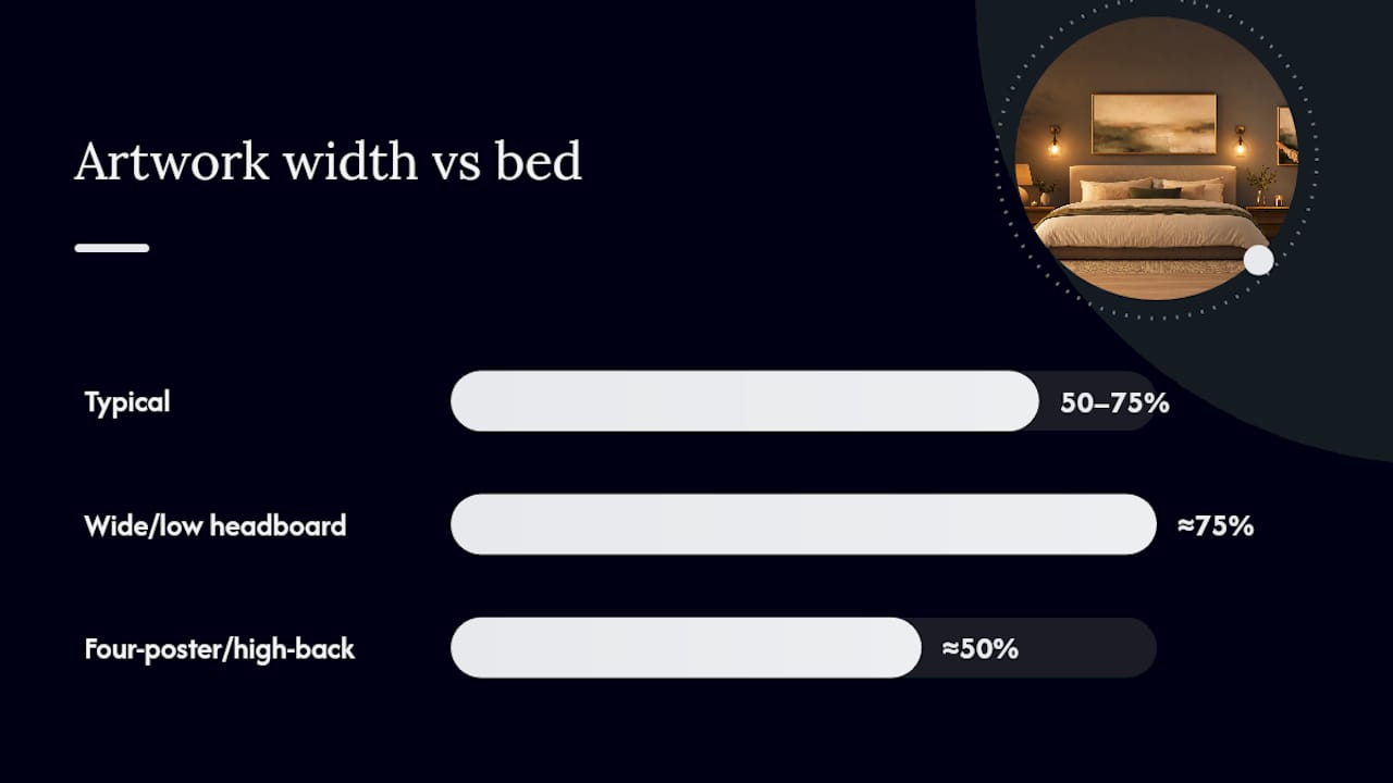
- Ensure wall art spans 50 to 75 percent of the bed’s headboard width and is placed with the centre around 145 to 150cm from the floor for visual harmony.
- Use warm white lighting and layered, adjustable fixtures to maintain the softness and colour integrity of the art during evening hours.
- Opt for textured canvas or matte finishes with neutral frames and avoid glare from glass or acrylic for longevity and a softer mood.
- Regularly clean and protect art from direct sunlight and humidity fluctuations to preserve its restful appearance over time.
Table of Contents
- What styles of bedroom calming art actually work?
- How do you choose the right calming art for your bedroom?
- Where exactly should you hang art above a bed?
- Which colours and lighting keep bedroom art calming at night?
- Which materials and frames suit a calm bedroom look?
- How Frametheworld’s own guidance and collections support calm bedroom art
- Does the style of art actually affect how well you sleep?
- How do you personalise calming art without losing the calm?
- How do you keep bedroom art looking fresh over time?
- A curated wall as an anchor, not decoration
- Ready to choose your own calming piece?
- Sources
- FAQ
What styles of bedroom calming art actually work?
Some artwork settles a room down. Some winds it up. The difference usually comes down to detail, contrast, and how much the eye has to work to “read” the image. Here are the five style families worth shortlisting for a genuinely restful bedroom.
Nature photography and misty landscapes. Soft-focus woodland, fog over hills, or a quiet coastline works because horizon lines and low contrast give the eye somewhere to rest rather than somewhere to search. Avoid anything with hard, punchy colour grading. A washed-out, slightly desaturated landscape reads as calmer than a vivid one, even when the subject matter is identical.
Botanical single-stem prints and pressed-flower studies. A single eucalyptus branch or one dried poppy on a plain background does more for a bedroom than a busy floral collage ever will. The visual quietness comes from restraint: one subject, generous negative space, minimal colour variation.
Soft abstract washes and muted colour fields. These are the pieces that ask nothing of you. No subject to interpret, no story to follow, just tonal movement across a canvas. Frametheworld’s Wabi Sabi wall art collection leans into this directly, using hand-painted texture and imperfection rather than sharp digital precision. This suits a bedroom far better than anything glossy.
Minimalist line art and single-motif drawings. A single continuous line sketching a body, a leaf, or a mountain range strips detail back to almost nothing. Frametheworld’s guide to minimalist styles covers nine variations worth knowing before you commit to one.
Coastal and seascape motifs. Popular for good reason, water imagery reads as calming when it’s handled with restraint. Pale sand, soft grey sea, muted sky. Pair it with warm neutrals in the room rather than cold whites, or it can tip into feeling clinical rather than soothing.
How do you choose the right calming art for your bedroom?
Start with the mood, not the picture. Decide whether you want the room to feel restful (low energy, muted tones), restorative (nature-heavy, greens and blues), or cosy (warmer neutrals, softer edges), then pick a colour family that matches your existing bedding and curtains rather than fighting against them.
From there, work through this checklist:
- Measure the wall where the art will hang, particularly above the bed.
- Apply the 50–75% rule: your art (or grouped arrangement) should span 50 to 75% of the headboard’s width, a principle Frametheworld’s own sizing guide sets out with paper templates you can print and test on the wall before ordering anything.
- Choose orientation. Landscape formats generally support a bed as the room’s focal point better than tall portrait pieces, which can visually compete with the headboard.
- Decide on permanence. Canvas gives a soft, textured finish that suits abstracts and landscapes. Matte paper behind a simple frame is more affordable and easier to swap out later. Framed glass feels more formal and durable but reflects light.
- Set a budget and timeline. Ready-made prints ship quickly; bespoke commissions typically involve a design and approval stage before production, so build in a few weeks if you’re going custom.
- Check for visual clutter nearby. A striking piece next to an overstuffed shelf or a mirror wall loses its calming effect fast, a point design guidance on decluttering makes repeatedly.
Pro Tip: Print your art choice at actual size on cheap paper (or tape sheets together) and stick it to the wall for 24 hours before buying. Colours and scale that look right on a screen often feel completely different once you’re lying in bed looking up at them.
Where exactly should you hang art above a bed?
Scale is the single most common mistake in bedroom styling. A print that looked generous in a shop or online listing often shrinks dramatically once it’s on a full wall, and an undersized piece above a bed reads as an afterthought rather than a focal point.
Go narrower and it looks stranded; go wider and it can overwhelm the wall rather than settle it. For an unusually wide or low headboard, lean toward the higher end of that range, and for four-poster or high-backed beds, the lower end usually reads better. Frametheworld’s own placement guide walks through exactly how to adjust the ratio for awkward wall shapes.
Height matters just as much as width. As a general guide, the centre of the artwork should sit around 145 to 150cm from the floor, or align with the top edge of the headboard if you have one. Drop that height slightly in rooms with lower ceilings to avoid a cramped feel.
For gallery-style arrangements:
- Keep spacing between pieces consistent, usually 5 to 8cm apart.
- Stick to one dominant palette across the grouping rather than mixing bold contrasts, since scale and cohesion directly affect how much energy a wall gives off, and symmetrical layouts read as noticeably calmer than scattered ones.
- Limit a bedroom grouping to three or four pieces maximum; more starts to compete with the room’s function as a place to switch off.
In smaller bedrooms, skip the wall entirely for some pieces. Leaning a framed print on a chest of drawers, stacking two small prints vertically on a narrow shelf, or propping one against a windowsill all avoid the crowded feeling a gallery wall can create in a tight space.
Which colours and lighting keep bedroom art calming at night?
Palette does most of the emotional work here. Muted blues echo sky and water and tend to lower visual energy. Nature-inspired greens bring an outdoor association that reads as restorative rather than stimulating. Sandy taupe and cream act as a neutral base that lets a single piece stand out without shouting, and soft blush adds warmth without tipping into anything visually loud. Interior designers consistently point to these muted, nature-adjacent tones as the backbone of a genuinely restful bedroom scheme.
Lighting changes how any of these palettes actually behave once the sun goes down. Warm white bulbs (around 2,700 to 3,000 Kelvin) keep colours from turning cold and clinical in the evening. Dimmable fittings let you soften the room’s overall brightness without losing the art altogether, and low-angle picture lights or bedside lamps flatter texture in a way that a single harsh overhead fitting never will. Layered, adjustable lighting lets the same piece feel gentle at 10pm and clear enough to appreciate properly in daylight, a balance lighting specialists frequently recommend for bedrooms specifically.
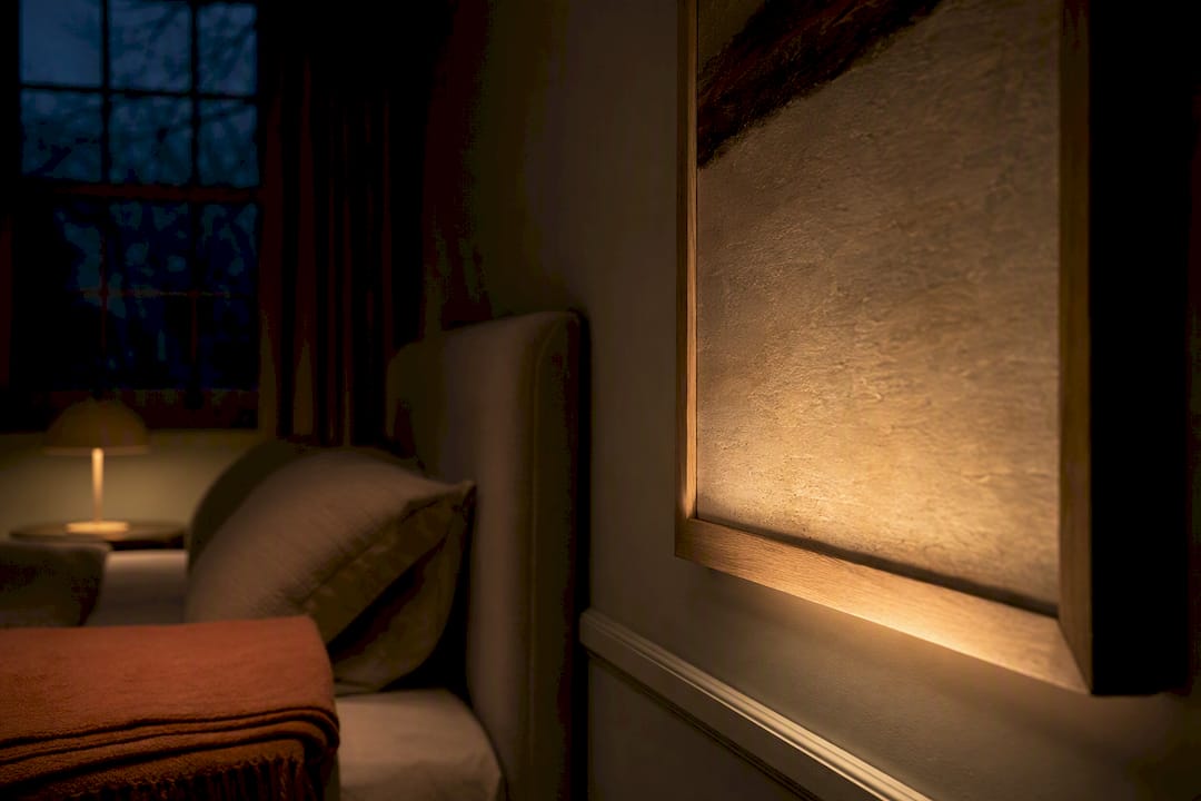
Pro Tip: Before ordering, view any digital mockup or physical sample under your bedroom’s actual evening lighting, not daylight through a shop window or a bright office. Colours that look neutral under fluorescent light can shift warmer or cooler than expected once your own lamps are the only light source.
Which materials and frames suit a calm bedroom look?
The surface an image is printed on changes its mood almost as much as the image itself.
- Canvas softens edges and adds visible texture, which suits muted abstracts and landscape photography particularly well. It absorbs light rather than bouncing it, useful in a room where you don’t want glare near the bed.
- Matte paper prints behind a simple frame are the most affordable route and produce almost no glare, which makes them a sound choice for darker or north-facing bedrooms.
- Acrylic and glass finishes add contrast and vibrancy but reflect light aggressively. Use them sparingly, and only where you actually want a sharper, clearer look rather than a soft one.
- Frame choice matters more than people expect. Thin, neutral frames (oak, ash, matte black) or floater frames keep the visual edge minimal. Leaving a canvas unframed or simply mounted often feels softer still.
- Humidity is worth a thought if the bedroom sits close to an en-suite. Canvas tolerates fluctuating humidity better than unsealed paper, which can ripple over time in consistently damp air.
How Frametheworld’s own guidance and collections support calm bedroom art
Frametheworld’s sizing guide and placement guide both centre on the same practical principle: correct scale and thoughtful placement change how energetic or settled a room feels, and getting that ratio wrong is more common than getting the colour wrong.
Bespoke commissioning can be considered when a wall doesn’t fit standard sizing, or when a specific palette needs to be matched precisely to existing bedding or paint rather than approximated from a ready-made range. The process typically runs measurement first, then a design or mock-up stage for approval, then production and delivery, allowing for adjustments before the final product is finished.
Interior designers consistently argue that calming art works best when it reflects something the occupant genuinely values, whether that’s stillness, nature, or a particular memory, rather than art chosen purely to match a colour scheme. That emotional fit is what turns a bedroom into an actual restorative retreat rather than a well-decorated room that happens to have a bed in it.
Does the style of art actually affect how well you sleep?
The link between what’s on your wall and how you actually feel in a room isn’t just decorative theory. Low-detail, low-contrast imagery requires almost no cognitive effort to process, which is precisely why misty landscapes and soft abstracts read as restful while busy, high-contrast pieces read as stimulating, even hung in an identical spot.
Bold, saturated art, think graphic prints, high-contrast portraits, or anything with sharp geometric patterns, tends to keep the eye and brain more active. That’s fine in a hallway or home office, where a bit of energy is welcome. In a bedroom, it works against the room’s actual job.
Repetition and symmetry play a role too. A single calm image, or a symmetrically balanced pair, settles faster than an asymmetric cluster of mismatched pieces, because the eye doesn’t have to keep re-scanning the wall to make sense of it. This is part of why scale and arrangement measurably affect perceived visual energy, not just personal taste.
None of this means bold art is banned from a bedroom. It means placement matters: a punchier piece works better on a side wall you glance at occasionally than directly above the pillow, where it’s the last thing you see before switching off the lamp.
How do you personalise calming art without losing the calm?
Calming doesn’t have to mean generic. The trick is choosing within the calming style families rather than picking whatever looks soothing in isolation, then adjusting palette and subject to match your own taste.
If you’re drawn to bold colour but still want a restful bedroom, look at cropped or edited sections of a bolder piece rather than the full composition. Frametheworld’s Pop Art collection includes quieter, more muted pieces within a generally punchier range, proof that personality and calm aren’t mutually exclusive if you’re selective about which piece and how it’s framed.
Match subject matter to what genuinely means something to you. If you grew up near the coast, a seascape will carry more weight than a generic forest print, even if both fall into the same “calming” bracket on paper. If a particular flower or plant has personal significance, a botanical study of that specific species will do more for the room than a decorative floral print chosen purely because it matched the cushions.
Texture is another personalisation lever people overlook. A hand-painted, textured piece brings a tactile quality that a flat digital print can’t replicate, which is part of why texture-led collections work so well for readers wanting something that feels considered rather than mass-produced. Bring in existing furniture tones, wood finishes, and metal accents when picking a final palette, rather than treating the art as a separate decision from the rest of the room.
How do you keep bedroom art looking fresh over time?
Calming art loses its effect quickly if it starts looking tired, faded, or dusty, so a little maintenance goes a long way.
Dust regularly with a soft, dry cloth or a soft brush attachment, working in one direction rather than circular motions that can drag grit across the surface. For canvas pieces, avoid anything damp unless the manufacturer explicitly says otherwise, since moisture can affect the weave and cause subtle warping over months.
Keep art out of direct sunlight where possible. UV exposure fades pigments unevenly over time, which is particularly noticeable on muted, soft-toned pieces where colour balance is the whole point. If a wall gets strong afternoon light, consider a UV-protective glass or acrylic glazing, or simply rotate pieces between rooms every year or two.
Check hanging fixtures periodically, especially in older properties where wall plaster can shift slightly. A piece that’s drifted a few degrees off level undercuts the sense of calm faster than almost anything else in the room. Humidity control matters too, particularly in bedrooms near bathrooms, where fluctuating moisture can affect both canvas tension and frame joints over several seasons.
A curated wall as an anchor, not decoration
Calm bedroom art isn’t wallpaper you forget about. Done well, it’s the one fixed point your eye returns to every night and every morning, which is exactly why the scale and palette decisions matter more than people assume. Use the checklist here, test under evening light, and if your wall doesn’t fit anything standard, ask Frametheworld for a sizing template before you commit to anything.
— Lennard
Ready to choose your own calming piece?
If you’ve read this far, you already know the shape of what you’re after: something soft, well-scaled, and colour-matched to a room built for winding down. Frametheworld’s Wabi Sabi wall art collection is built around exactly that brief, hand-painted, texture-led abstracts with none of the flatness you get from a mass-printed poster. If you want more personality without losing the calm, the Pop Art collection includes muted, pared-back pieces that can be cropped or toned down further to suit a bedroom rather than a studio.
Commissioning a bespoke piece follows four simple steps: measure your wall, request a size template, approve a mock-up, then wait for delivery. There’s no need to compromise on an odd-shaped wall or an exact colour match. Start by browsing the Wabi Sabi collection and request a mock-up sized to your own bedroom wall before you decide.
Sources
FAQ
What kind of art looks good in a bedroom?
Nature photography, botanical prints, soft abstract washes, and minimalist line art all work well because they’re low in detail and contrast, which keeps the room visually calm rather than stimulating.
What are some calming bedroom decor ideas?
Pair muted colour palettes with soft, layered lighting and a single well-scaled piece above the bed rather than several competing items; keeping surrounding shelves clutter-free also helps the effect last.
What colours are calming for bedrooms?
Muted blues, nature-inspired greens, sandy taupe, cream, and soft blush are the palettes most consistently recommended for restful bedrooms, especially when echoed between the art and the room’s existing bedding or paint.


Leave a comment
This site is protected by hCaptcha and the hCaptcha Privacy Policy and Terms of Service apply.