

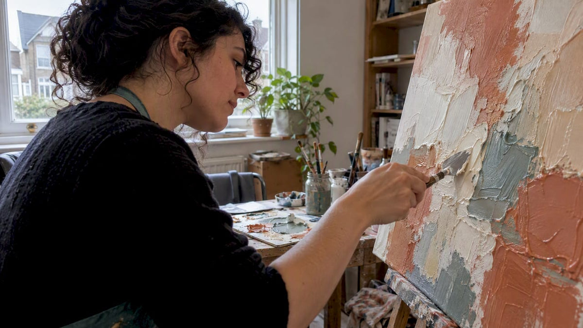
Textured canvas painting uses raised surfaces, such as thick acrylic, gel medium or modelling paste, instead of flat colour alone to create tactile, sculptural artwork. A beginner-friendly route in is acrylic paint plus an acrylic gel or paste and a palette knife, worked in thin, controlled layers. A layered workflow with full drying between coats can help beginners achieve reliable results and reduce the risk of cracking.
TL;DR:
- Use acrylic gel or modeling paste on primed, stretched canvas; reserve rigid plaster for a solid panel because canvas flex can cause cracking.
- Build relief in thin passes and let each layer dry completely; one overloaded application can sag, weaken adhesion, and crack later.
- Choose heavier cotton or tighter woven linen, with a deeper stretcher bar, for heavier relief; standard cotton suits only light to moderate texture.
- Keep color to two or three related tones plus one contrasting highlight, then dry brush raised peaks to strengthen light and shadow.
Table of Contents
- Materials and tools you need for raised texture on canvas
- Core texture techniques and what each looks like
- A step-by-step weekend project: make a textured abstract canvas
- Composition, styles and where textured canvases work best
- Care, display and basic conservation for textured canvases
- Examples and short prompts to try at home
- Advanced layering and blending techniques specific to textured painting
- Colour theory application in textured works to enhance dimensionality
- Customising texture according to different painting styles
- Tips for photographing and filming textured canvas paintings
- Selecting the right canvas type and weight to support heavy textures
- Publisher perspective: when to DIY and when to commission hand-painted texture
- Frametheworld’s hand-painted textured canvases and commission route
- FAQ
- Sources
Materials and tools you need for raised texture on canvas
Before picking up a knife, you need a surface that can take weight and products designed to hold their shape once applied. A primed, stretched canvas is the standard starting point, paired with acrylic paint and either an acrylic gel or modelling paste as the texture-building medium.
- Primed stretched canvas, acrylic paint, and an acrylic gel or paste medium.
- Palette knives for applying and shaping raised marks.
- Stiff brushes and sponges for stippling, dabbing and broken colour.
- Combs or improvised plastic tools for scratching patterns into wet paint.
- A palette, water, and cloths for mixing and clean-up.
Golden Artist Colors notes that acrylic gels and pastes are formulated specifically to vary texture and working properties, which is why they outperform plain thick paint for raised effects. Gel and paste mediums stay flexible once dry, which matters because a stretched canvas moves slightly with temperature and humidity. Rigid plaster is a specialist choice best kept for panels or heavily reinforced boards rather than a standard flexible canvas, since a stiff material on a flexible support is more prone to cracking over time.
If you are buying a finished textured piece rather than making one, check listing photos for genuine raised texture rather than a printed pattern, ask the seller for close-up shots, and confirm the substrate and frame depth before ordering.
Pro Tip: Test any new gel, paste or tool on a scrap board first, since drying time and final texture vary by brand and thickness.
Core texture techniques and what each looks like
Most textured canvas work comes down to a handful of repeatable techniques, each producing a distinct surface quality.
- Impasto and palette-knife work: thick paint or paste applied directly, building visible height and bold relief.
- Sgraffito: scratching through a wet layer with a comb or tool tip to reveal the colour beneath.
- Scumbling and dry brushing: a near-dry brush dragged across the surface catches the raised tops of a relief, leaving broken, atmospheric colour in the recesses.
- Stippling: repeated dabbing with a sponge or stiff brush builds fine, even tactile patterning.
Impasto and palette-knife marks are generally used for the boldest relief, since thick paint or paste holds its shape as it dries. Behind The Draft recommends matching paint viscosity to the effect: thicker mixtures for height, thinner ones for fine detail, and testing stippling, dry brushing or sgraffito on scrap material before committing to the final canvas.
Knowing these core techniques covers the range of marks most textured canvas paintings rely on, from the gallery-style relief of a palette-knife abstract to the delicate crackle of sgraffito over a dried base.
Layering matters as much as the technique itself. A scumbled pass over dry impasto adds atmosphere without hiding the relief underneath, while stippling works well as a finishing texture over a flatter base. Always test a new combination on an offcut before applying it to a piece you intend to keep.
A step-by-step weekend project: make a textured abstract canvas
This project fits comfortably into a weekend because acrylic dries faster than oil, though thick texture still needs patience since drying time depends on layer thickness, humidity and ventilation, according to Golden Artist Colors.
- Check your canvas. Choose a primed, stretched canvas with a frame deep enough to hang without a separate frame if you want a gallery edge.
- Lay a thin base colour. Cover the surface evenly and let it dry fully before adding any texture.
- Build texture in shallow layers. Apply gel or paste with a palette knife in controlled passes, keeping each layer thin rather than piling material on in one go.
- Let each layer dry completely before adding the next; this is what gives a durable, readable relief rather than a surface prone to cracking or sagging.
- Add colour once dry. Glaze over the relief, dry-brush the raised tops, or add highlights to pick out the texture.
- Varnish once fully dry. A clear acrylic varnish protects the surface and evens out the sheen across flat and raised areas.
AccessArt identifies the most common beginner mistake as trying to build height in one overloaded layer, which weakens adhesion and leads to sagging or cracking later. Thin, patient layers consistently outperform a single thick application.
Pro Tip: Photograph each stage as you work: it helps you track drying times and gives you a reference if you later want to repeat or adapt the effect.
Once varnished and fully cured, hang the piece using a frame depth that suits your wall. A deep-edge canvas can work well without additional framing, while a thinner canvas may benefit from a simple floating frame.
Composition, styles and where textured canvases work best
Texture reads differently depending on the composition behind it, so it helps to pick a style direction before you start building relief.
- Minimalist relief: a single raised shape or subtle linen-like texture on a plain field, suited to understated spaces.
- Geometric blocks: flat-edged raised sections in contrasting tones, strong over a sofa or sideboard.
- Scraped horizontals: palette-knife lines dragged across the canvas, evoking a horizon or landscape without literal detail.
- Organic waves and gestural sweeps: looser, movement-led marks that suit a hallway or statement wall.
For sizing, a wide horizontal piece suits a sofa or long wall, a vertical format works well in a narrow hallway, and a smaller square canvas is well suited to a bedside or shelf. Keep the palette limited, with a few tones plus a highlight, so the relief stays legible from across the room rather than getting lost in competing colour.
Care, display and basic conservation for textured canvases
Flexible supports like stretched canvas need flexible materials to match. Acrylic gels and pastes stay workable as the canvas moves slightly with temperature and humidity, while rigid plaster is better suited to a solid panel than a stretched canvas.
- Avoid hanging heavily textured work where it will be touched regularly, since raised passages are more vulnerable to knocks than a flat surface.
- Keep textured canvases away from damp spots and direct heat sources, both of which stress paint and support over time.
- Dust gently with a soft, dry brush or cloth rather than scrubbing raised areas.
- Leave enough clearance when hanging so you can access the surface for cleaning.
Conservation casework on painted surfaces, including a case study on a ship painting, documents cracking, flaking and delamination linked to unsuitable environments and handling. The same principles apply at a domestic scale: a stable support, a sensible location and gentle cleaning keep a textured piece looking sharp for years.
Examples and short prompts to try at home
If you want to start without overthinking the brief, pick one of these and commit to it for an afternoon.
- Monochrome linen relief: subtle all-over texture in one tone, ideal for a bedside or shelf.
- Scraped horizon: palette-knife horizontals in two tones, strong over a sofa.
- Geometric textured squares: several raised blocks in contrasting colours, suited to a hallway.
- Gestural sweep: loose, confident palette-knife strokes across the full canvas, a good statement piece for a living room.
- Layered plaster-like field: dense, all-over texture built in several thin passes, best viewed up close.
Photograph each stage as you build it. The sequence is useful for your own reference, and if you later decide to commission a maker to interpret the idea at a larger scale, those photos give them a clear starting point.
Advanced layering and blending techniques specific to textured painting
Once the basic workflow feels comfortable, layering becomes the main tool for adding depth rather than just height. Building several thin passes of gel or paste, each left to dry fully before the next, creates a more complex surface than one thick application, and reduces the risk of cracking that comes with overloading a single layer.
Blending within a textured surface works differently from blending on a flat one. Instead of mixing wet paint into wet paint, you work colour into the recesses after a layer has dried, using glazing or dry brushing so the raised tops stay a different tone to the valleys. This contrast is what makes relief readable from across a room.
Combining techniques within layers adds further complexity: a scraped sgraffito pass over a dried impasto layer reveals colour beneath without disturbing the texture itself, while a scumbled glaze over the same surface softens edges without flattening them. Working this way, one layer at a time, with full drying between each, is what separates a considered, durable textured piece from one built too quickly in a single sitting.
Colour theory application in textured works to enhance dimensionality
Texture and colour work together to create the illusion of depth, so the palette you choose should support the relief rather than compete with it. Warm tones tend to advance visually, while cool tones recede, so placing a warm highlight on a raised peak and a cooler tone in the recess beneath it exaggerates the sense of height even on a relatively shallow relief.

Contrast matters more than variety. A limited palette of two or three closely related tones, plus one higher-contrast highlight colour, reads more clearly as dimensional than a broad mix of unrelated hues. Light also plays a role: raised areas catch more light and read lighter, while recessed areas sit in shadow and read darker, so a single base colour can appear to shift in tone purely because of the texture beneath it.
Dry brushing with a lighter tone over the highest points of a relief, once it is fully dry, reinforces this natural light and shadow pattern rather than fighting it. The goal is to let the physical structure of the paint do some of the work that colour alone would otherwise have to do.
Customising texture according to different painting styles
The right amount and type of texture depends heavily on the style you are working in. A modern abstract piece can carry bold, high-relief palette-knife work across the whole canvas, since there is no representational detail to compete with the texture, this is where the boldest impasto and sgraffito combinations tend to work best.
A landscape, by contrast, usually benefits from more selective texture. Reserve raised, knife-applied paint for elements that genuinely have physical presence, such as foliage, rock faces or a textured sky, while keeping smoother passages for open water, sky gradients or distant detail where flat colour reads more naturally. Overloading a landscape with texture everywhere can flatten the sense of distance it relies on.
Geometric and minimalist styles tend to use texture more sparingly still, often confined to a single shape, border or linen-like ground, so the restraint itself becomes part of the composition. Matching the amount and placement of texture to the style you are working in, rather than applying a single heavy-handed approach everywhere, is what makes the finished piece feel intentional rather than accidental.

Tips for photographing and filming textured canvas paintings
Flat, front-on lighting is the main reason textured paintings photograph badly. Raised and recessed areas need shadow to read as three-dimensional, so angle a single light source from the side rather than lighting the canvas straight on, this exaggerates the shadows in the relief and makes the texture visible in a still image.
Shoot at a slight angle rather than dead-on to catch the way light falls across the raised passages, and take a second shot straight on for colour accuracy. For video, a slow pan across the surface, combined with the same side lighting, captures how the texture changes as the viewing angle shifts, which a single photograph cannot show.
Natural daylight from a window, with the canvas turned side-on to the light, tends to give the most even and flattering shadow pattern without the harshness of a single direct lamp. Avoid flash photography directly at the canvas, since it flattens shadows and can wash out the texture entirely.
Selecting the right canvas type and weight to support heavy textures
Not every canvas can carry a heavy relief without sagging or cracking over time. A standard cotton canvas works for light to moderate texture, but heavier gel or paste work benefits from a higher-weight canvas or one with a deeper stretcher bar, since a deeper frame gives the fabric more support against the pull of thick, drying medium.
Linen canvas, where available, handles heavier texture more reliably than standard cotton because of its tighter, more stable weave, though it costs more. Whichever fabric you choose, check that it is properly primed before you start, an unprimed or thinly primed canvas absorbs medium unevenly and can lead to patchy adhesion under thick texture.
For particularly ambitious relief work, choose a deep-edge canvas that provides enough structure to support substantial palette-knife or paste work without excessive flex. If you are set on using rigid plaster rather than a flexible acrylic medium, a solid panel is a better substrate than a stretched canvas, since plaster does not flex with the fabric and is more prone to cracking on a surface that moves.
Publisher perspective: when to DIY and when to commission hand-painted texture
Hand-painted texture tends to hold its appeal with buyers and designers precisely because it cannot be mass-produced: every knife mark and scraped edge is a one-off decision. Whether to DIY or commission usually comes down to three things: scale, time and how exacting your finish expectations are. A small practice piece is a good DIY candidate; a large statement wall or a specific colour match for a finished room is often better handed to a painter who can work from previews and refine the piece before it ships.
— Lennard
Frametheworld’s hand-painted textured canvases and commission route
We offer hand-painted canvases, with bespoke sizing and a preview before anything ships. If building your own relief feels like more time than you have, this is the direct alternative: you describe the size, palette and style, and a painter does the knife work for you.
- Browse ready-to-buy textured pieces in our Abstract collection.
- Explore tactile, imperfection-led pieces in our Wabi Sabi range.
- Start a bespoke commission from our Handpainted masterpieces page.
FAQ
What do you use to make textured art on canvas?
The core kit is acrylic paint, an acrylic gel or modelling paste, and a palette knife, applied to a primed stretched canvas. Golden Artist Colors notes that stiff brushes, sponges and improvised tools like combs are also useful for varying the mark-making. Test any new product on scrap board before working on your final piece.
What is the 70/30 rule in painting?
A common composition guideline uses a dominant colour or tone with the rest reserved for contrast or accents. It is a general composition principle rather than a fixed technical rule, and definitions of the exact split vary between sources.
What are some types of painting?
There is no single agreed list of types of painting; definitions vary across art education sources. Common groupings instead distinguish paintings by medium (oil, acrylic, watercolour, gouache) or by approach (realism, abstract, impressionism), rather than by a fixed set of seven categories.
What is the best plaster for canvas art?
For a standard flexible stretched canvas, an acrylic gel or modelling paste is the more reliable choice, since these mediums are designed to stay flexible as the canvas moves. Rigid plaster is better suited to a solid panel or heavily reinforced board, where it will not be flexed and is less likely to crack.
Sources
- DIY Canvas Art: Step-by-Step Tutorial To Create Stunning Handmade Wall Decor (2026)
- Painting of a Ship at Sea


Leave a comment
This site is protected by hCaptcha and the hCaptcha Privacy Policy and Terms of Service apply.