

In open plan rooms, treat artwork as a zone anchor: one large piece or a coordinated cluster aligned with your furniture will define and unify the space. This approach delivers three things at once: clear zone definition, a visual anchor for the eye, and cohesion across the whole floor. Lennard has observed that this principle solves the “big empty room” problem more reliably than any amount of extra furniture.
TL;DR:
- Use large or coordinated art clusters aligned with furniture widths to define zones and create visual anchors in open plan rooms.
- Select art that occupies roughly two-thirds of the furniture width and considers eye height for both seated and standing views.
- Hang art at proper heights, centered relative to furniture, and avoid statement pieces in pathways for better visual balance.
- Prefer bold, simple compositions with non-reflective finishes and slim or frameless mounting to ensure impact across large, light-filled spaces.
- Incorporate repeated colors and strategic lighting to build cohesion without matching every zone, while prioritizing fewer, larger statements over many small pieces.
Table of Contents
- How art defines zones in an open plan layout
- Choosing focal art: scale, proportion and sightlines
- Placement and measuring: practical hanging templates
- Gallery walls and multi-panel art for large rooms
- Materials, frames and finishes for open plan spaces
- Styling tips to create cohesion between zones
- Expert checklist and scenarios from Lennard and Frametheworld
- When to commission bespoke large-scale pieces
- Frametheworld: bespoke hand-painted artworks for open plan spaces
- FAQ
- Sources
How art defines zones in an open plan layout
Open plan rooms struggle with one thing: boundaries. Without walls to separate the kitchen from the lounge or the dining area, your eye has nowhere to land, and the whole space can feel formless. Art solves this by acting as a visual anchor, a role Sophie Robinson’s open-plan project demonstrates clearly: a single large painting gives the eye somewhere to rest and breaks up the scale of the room.
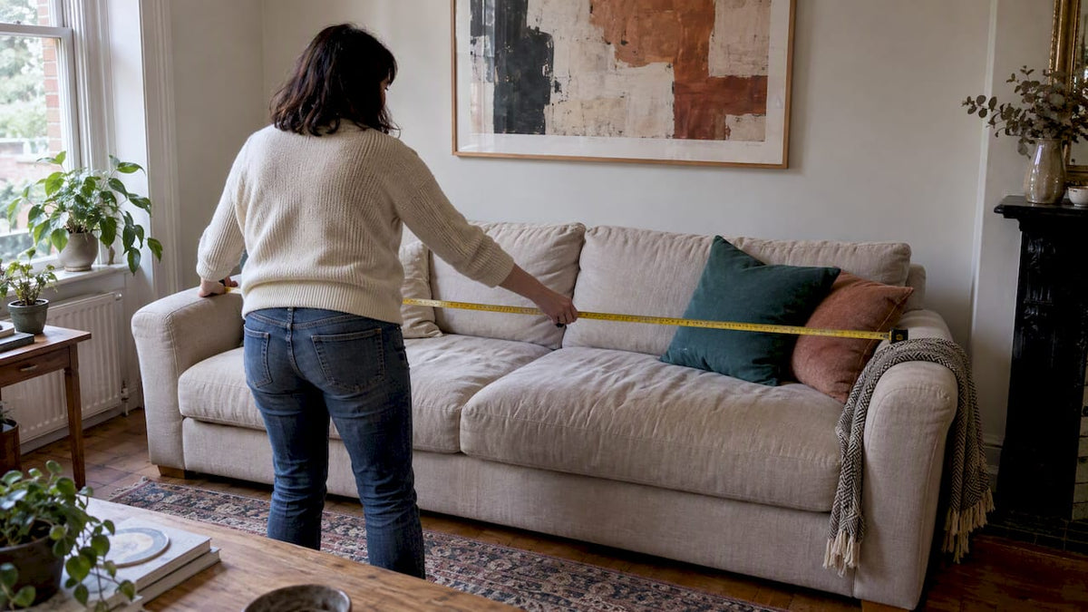
The trick is alignment. A piece hung above a sofa should sit within the width of that sofa, not the width of the wall behind it. Over a dining table, the art should echo the table’s proportions rather than the room’s. This geometric relationship tells the eye “this wall belongs to this furniture group,” which is exactly how zoning works without partitions.

Placement relative to circulation matters too. Avoid hanging statement pieces directly in a walking path’s sightline where they’ll be glimpsed only in passing; instead, position them where someone standing in the kitchen, seated on the sofa, or walking from the entrance will see them straight on.
Before hanging anything, try this:
- Stand in each seating or work zone and note what’s directly in your eyeline.
- Check that furniture groups already read as distinct clusters before adding art.
- Confirm the wall you’re using has enough blank space to let the piece breathe.
The Design Council’s guidance on design briefs makes a related point about public spaces: art integrated into the plan from the outset helps define routes and legibility far better than art added as decoration afterwards. The same logic applies at home.
Choosing focal art: scale, proportion and sightlines
Getting scale right is the difference between a piece that anchors a room and one that disappears into it. A broad rule of thumb: measure your typical viewing distance, then choose art wide enough to occupy a meaningful share of your sightline from that spot, rather than sizing to fit a gap on the wall.
- Measure your viewing distance from the main seating or standing position to the wall, since this determines how much visual weight the piece needs to carry.
- Apply an adjusted two-thirds principle: in open plan rooms, art should occupy roughly two-thirds of the furniture grouping’s width below it, which reads correctly from across a larger room than the traditional closer-range guideline assumes.
- Account for eye height, which in an open plan living or dining zone usually sits lower for seated viewing and higher for standing sightlines from a kitchen island, so choose a vertical centre point that works for both where possible.
- Favour bold, simpler compositions over intricate detail. Fine brushwork and busy patterns lose all impact at six or eight metres, while strong shapes, high contrast, and confident colour blocking hold their presence across the room.
Placement and measuring: practical hanging templates
Measurements remove the guesswork that makes open plan walls feel haphazard. These templates work for most standard room heights and can be adjusted for double-height spaces.
- Single statement piece: centre the artwork horizontally over the furniture group, with the centre point roughly 145 to 150 centimetres from the floor, adjusting downward slightly if viewing is mostly seated.
- Triptych or multi-panel: leave consistent gaps between panels, typically 5 to 8 centimetres, so the eye reads them as one composition rather than three separate pieces.
- Double-height or high walls: rather than centring on the full wall height, centre the piece relative to the furniture below it and let the extra height above become breathing room, not a reason to hang higher.
- Centring between windows or doors: measure the midpoint of the available wall segment, not the whole wall, so the art relates to its immediate architecture.
Before committing to hooks, check sightlines from the sofa, the dining chairs, and the kitchen counter. A piece that looks perfectly centred from standing may sit awkwardly off-axis once you’re seated.
Gallery walls and multi-panel art for large rooms
A single statement piece isn’t always the right call. Multi-panel layouts can do the same anchoring job while adding texture, provided the cluster is planned rather than improvised.
- Balanced grid: evenly sized and spaced pieces in rows and columns, which suits modern, formal rooms and reads cleanly from a distance.
- Staggered split-panel: two or three panels of varying width hung at slightly offset heights, better suited to a more relaxed, contemporary open plan scheme.
- Salon-style cluster: a denser mix of sizes and frames, which works best in smaller zones within the open plan, such as a reading nook, rather than across a long sightline.
Whichever layout you choose, cohesion comes from repetition: repeat one or two colours across the panels, keep frame finishes consistent, and resist the urge to include too many small, detailed pieces. From across an open plan room, a cluster with too much fine detail reads as visual noise rather than a composition.
Materials, frames and finishes for open plan spaces
Large glazing and long sightlines change what materials work. A glossy print facing a wall of windows will throw glare back at anyone viewing it from an angle, so a non-reflective or low-gloss finish holds up far better over the course of a day as light shifts.
- Choose matte or textured surfaces over high-gloss prints when the piece faces windows or bright artificial lighting.
- Keep frames slim or opt for gallery-wrapped canvases with no frame at all, letting the piece feel integrated with the wall rather than boxed in.
- Favour hand-painted canvas over large photographic prints where you want tactile presence. The texture of brushwork reads at distance in a way flat print surfaces don’t, giving the piece more physical weight in a big room.
Styling tips to create cohesion between zones
Cohesion in an open plan room comes from repetition, not matching. Repeat one or two accent colours from your art across cushions, a vase, or a rug in another zone, and the eye will link the areas together even though the furniture differs.
Rugs and lighting do double duty here. A rug that echoes a colour from the artwork above it visually ties the piece to its furniture group, a tactic Country Living’s guide to open-concept spaces also recommends through “comfy clusters” built around generous rugs and larger furniture rather than scattered small items. Lighting aimed at or near a piece reinforces the same effect after dark. A UK interior trends guide covering 2026 living rooms makes a similar case for rugs and furniture groupings as the backbone of a cohesive open plan scheme.
Resist filling primary sightlines with many small, busy pieces. Fewer, larger statements consistently read as more intentional.
Pro Tip: When in doubt, remove one piece from a cluster rather than add another: open plan rooms almost always benefit from more negative space, not less.

Expert checklist and scenarios from Lennard and Frametheworld
Lennard’s shorthand checklist before any piece goes on the wall: measure viewing distance, confirm the finish suits the light, check scale against the furniture group, and order a sample or preview before committing.
- Family open plan kitchen-diner: one large abstract canvas, roughly two-thirds the width of the dining table, centred over the table.
- Loft studio with double-height wall: a vertical triptych anchored to the seating group below, leaving the upper wall as breathing space.
- Combined dining and living zone: two coordinated pieces, one per furniture cluster, sharing a colour palette to link the zones visually.
For bespoke sizing or hand-painted options tailored to any of these scenarios, collections offer a practical starting point.
When to commission bespoke large-scale pieces
Commissioning suits rooms with awkward proportions or a very specific colour brief, since you get exact scale and a composition nothing off-the-shelf matches. The trade-off is lead time and cost. Always ask for a preview and at least one revision before the piece goes into production.
— Lennard
Frametheworld: bespoke hand-painted artworks for open plan spaces
If you’ve measured your wall and can’t find a ready-made piece at the right scale or in the right palette, commissioning can solve that problem. Custom hand-painted pieces can be created to order, working from your dimensions and colour brief, with a preview and revisions before anything ships. Browse our Abstract, Modern Abstract, or Landscape collections for a starting point, or head to Frametheworld to request a sample and talk through your room’s measurements with us.
FAQ
How can I decorate my wall in an open plan room?
Start by identifying your furniture groupings, then choose one large piece or a coordinated cluster for each group rather than treating the whole wall as a single canvas. Align the art’s width with the furniture below it so the two read as one unit.
What is the 2/3 rule for hanging pictures?
The traditional rule suggests art should span roughly two-thirds the width of the furniture it hangs above, such as a sofa or console table. In open plan rooms, this ratio still applies, but it’s worth checking from a greater viewing distance since the piece needs more visual weight to hold its own across a larger space.
What is the latest trend for walls in open plan homes?
Large-scale abstract and textured hand-painted canvases used as zone anchors are a strong current direction, paired with rugs and lighting that tie the art visually to its furniture group. The emphasis is on fewer, bolder statements rather than many small decorative items.
How do I make wall art look expensive in a large room?
Choose a non-reflective, textured finish such as a hand-painted canvas rather than a flat print, since texture reads as quality at distance in a way a glossy surface doesn’t. Pair it with a slim frame or a gallery-wrapped edge so the piece feels integrated rather than boxed in.
Sources
- By design: urban design in the planning system: towards better practice
- How to make an open-concept space feel cozier — Country Living


Leave a comment
This site is protected by hCaptcha and the hCaptcha Privacy Policy and Terms of Service apply.