

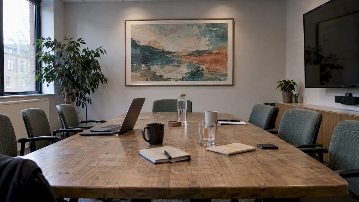
The best meeting room wall art is calm, matte and sized for the wall, and it hangs where it won’t fight with the screen, the lighting or the escape route. Choose a low-glare finish such as canvas, pick imagery that supports the conversation rather than competing with it, and check placement against seated sightlines and fire safety before anything goes on the wall. The rest of this guide shows you how, whether you are dressing a four-person huddle room or a full boardroom.
TL;DR
- Canvas is generally the safer finish for meeting rooms: low glare and a warmer feel. Glossy acrylic and glass-fronted frames can reflect lighting and screens.
- Pick calm, uncluttered imagery. Abstract and landscape work suit most rooms; avoid anything that distracts people on a video call.
- Nature imagery supports a restorative look, but research does not promise better alertness or performance from a single print.
- Check seated sightlines, camera view, wall construction, weight and escape routes before you fix anything.
- For a multi-room or commercial project, brief the art alongside AV, acoustics and daylight, not after the furniture is in.
Table of Contents
- What meeting room art is actually for
- Start with the room, not the picture
- Choose a finish that behaves under meeting-room lighting
- Subjects that work (and ones to think twice about)
- Visual calm is also an inclusion question
- Sizing and placement
- Check the practicalities before you drill
- Our perspective
- Commissioning art for a meeting room
- A simple process for a single room
- FAQ
- Sources
What meeting room art is actually for
A meeting room is a working room. People sit there for an hour or more, often looking at a screen, sometimes being looked at through a camera. Art in that room has three jobs: make the space feel considered to visitors, give eyes somewhere restful to land, and say something quiet about the organisation.
It has one job it should never do: get in the way. That is why the right question is less “what looks good?” and more “what looks good under this lighting, from these seats, on this wall?”
Academic work supports looking at the room as a whole. A 2024 systematic review of workplace wellbeing and interior design treats visual, acoustic and spatial conditions as interacting, so a picture is judged as part of the environment, not in isolation. Keep that in mind through every decision below.
Start with the room, not the picture
Before you look at a single image, note down five things about the room:
- Who uses it. Client-facing boardroom, internal team room, training space or a bookable huddle room?
- Where the screen and camera sit. The wall behind the screen, the wall behind the people on camera and the side walls all behave differently.
- Lighting. Windows, downlights, strip lights, and where their reflections land.
- Free wall. Subtract screens, whiteboards, doors, radiators, sockets, thermostats and fire equipment. What is left is your real canvas.
- Mood. Formal and quiet, or creative and energetic?
This is the same logic used in professional workplace projects. A 2026 UK case study from 360 Workplace on the Wildstone office describes meeting-room provision based on observed demand, with acoustic treatment, window film for glare and curated sightlines. The visual backdrop came after those decisions. If you are fitting out several rooms, brief the art at the same time as the AV and the acoustics. It is far cheaper to leave a wall space for a large piece than to retrofit one around a screen.
Choose a finish that behaves under meeting-room lighting
This is where most meeting room art goes wrong. The image is fine, but the surface throws a bright reflection of a window or downlight straight at someone’s seat.
Research from the Universities of Leeds, Sheffield and York on screen reflections identifies the size and luminance of the reflected light source, and the reflectance of the surface, as variables in how disturbing a reflection feels. In plain terms: the bigger and brighter the reflection, and the shinier the surface, the more it bothers people. The same reasoning applies to a shiny picture on a side wall.
| Finish | Look | Meeting-room behaviour |
|---|---|---|
| Canvas | Warm, textural, soft | Generally the safer low-glare option; works on most walls |
| Acrylic | Crisp, contemporary | Can reflect lighting; check it from every seat |
| Metal | Durable, clean-lined | Can feel cold; check for reflections |
| Framed paper under glass | Formal, traditional | Needs careful positioning to control reflections |
For most rooms, canvas is the practical answer. It also suits a hand-painted piece well, because the texture of the paint is part of the appeal and nothing sits between the viewer and the surface. If you do want glass or acrylic for a formal boardroom, test it first: stand and sit in every seat, switch on all the lights and look for reflections. Do the same from the camera position if the room is used for video calls.
As for frames, simple is safer: slim black, white or natural wood generally disappears into a modern room, so the artwork carries the effect.
Subjects that work (and ones to think twice about)
Abstract art
Abstract work is the easy choice for meeting rooms because it has no literal message to clash with the agenda, the brand or the visitor. Soft, layered colour fields and textured compositions give people something to rest their eyes on without demanding to be read. Our abstract collection and modern abstract collection are the usual starting points for office briefs. If you want a more understated, textured look, the wabi-sabi collection leans into imperfection and subtle surface.
Landscapes and nature imagery
Landscapes are a natural fit for rooms without a view. There is genuine evidence behind the instinct, but it is modest, so be careful what you promise. The 2024 review above found that visual connections with plants and natural objects enhance wellbeing. A 2023 systematic review of nature elements and worker stress looked at which biophilic elements affect stress in the workplace, and the research base still calls for more work. A 2023 study of a nature-adapted “virtual sky” lighting panel found no significant gain in alertness or cognitive performance compared with standard lighting.
The honest summary: nature imagery is a sound, restorative design choice. It is not a productivity tool, and nobody can promise that a landscape will make meetings shorter or sharper. Choose it because it makes the room pleasanter. Browse the landscape collection for calm horizons, woodland and coastal scenes.
Bold and graphic work
Pop art and strongly coloured pieces can be excellent in a creative studio, a brainstorm room or a reception-adjacent space. In a room where people sit for long, strongly contrasting patterns can become tiring. Put the louder work in circulation areas and keep the long-stay rooms quieter.
Things to avoid
- Literal imagery tied to your industry. A law firm with courtroom photography or an engineering firm with bridges reads as obvious. Abstract interpretations of the same theme feel more considered.
- Busy patterns directly behind a presenter or camera. On a video call, a fine repeating pattern can look noisy.
- Motivational slogans unless they are genuinely part of your culture. They age quickly and are the first thing visitors read.
- Anything that could offend or exclude visitors from different backgrounds. Neutral beats clever.
Visual calm is also an inclusion question
It is tempting to treat art as pure decoration, but research on workplaces points to why restraint matters. A University of the Built Environment study on neuroinclusive workplace design reports that both neurodivergent and neurotypical respondents found sound and glare common problems, and that people valued control over lighting and access to quiet rooms. The study frames acoustic comfort, privacy, visual calm and spatial flexibility as shared needs, not special accommodations.
For art, the implication is practical. Choose low-reflection surfaces, avoid avoidable visual stimulation, and don’t hang something so intense that it cannot be ignored. A calm piece that people stop noticing after five minutes is often the better piece.
Sizing and placement
As a rule of thumb, a single large work on the main wall looks more confident than a scatter of small frames. Small pictures spread along a long wall tend to look like an afterthought, while one generous piece or a deliberate pair gives the wall a focal point.
Height. In a room where most people sit, hang a little lower than you would in a corridor. Our guide to hanging art in open plan spaces explains the 145 to 150 cm centre-line we use for zoning rooms, and that is a sensible reference for standing areas. For a room where everyone is seated, adjust down a little and check from the chairs.
Width. Aim for a piece or group that fills roughly two thirds of the free wall, leaving breathing room at each side. A long boardroom wall suits a wide landscape format or a triptych, which also helps with a long table.
Distance from the screen. Keep art out of the primary viewing zone. If the screen is on one end wall, don’t hang something loud on the same wall where it competes with presentations.
Behind the camera. The wall that appears behind people on video calls is the most visible wall in your organisation to everyone outside it. A restrained, mid-tone piece with some depth usually looks best on camera.
Worked example. Take a six-person room with a 3.6 m long wall opposite the screen, a 1.2 m window at one end and a sideboard in the middle. The usable run is about 2.4 m. A horizontal piece around 150 to 160 cm wide sits comfortably above the sideboard, which leaves roughly 40 cm at each side. Measure your own wall, mark it with masking tape and live with the tape for a day before ordering.

Check the practicalities before you drill
In a UK workplace, a picture is also something fixed to a building that other people have to evacuate. Before installation, confirm the fixing method, wall construction, weight, access equipment and escape-route clearance with the responsible person or project team.
That is not box-ticking. GOV.UK’s fire safety guidance for offices and shops, dated 16 August 2024, says the risk assessment must focus on all relevant persons and give particular attention to people with disabilities and others who may have difficulty evacuating. Artwork should never narrow a corridor, obstruct a fire exit or block signage. If your room has a stud partition, glass wall or acoustic panelling, ask the building manager or installer which fixings are suitable before ordering anything large.
A short pre-install checklist:
- Wall type and the right fixings for the weight
- Clear routes to doors and exits, and visible safety signs
- Reflection test from every seat and from the camera
- Whether a lease or landlord approval is needed for fixings
- Who will hang it, and whether access equipment is required
Our perspective
We are asked for meeting room art far less often than for living rooms, yet the brief is harder, because the room has to be photogenic for visitors, quiet for the people working in it and sensible for the building. Our view is simple.
First, buy for the room you have. A beautiful piece in the wrong finish is a poor purchase. We would nearly always steer a meeting room towards canvas, and towards colours that sit with the carpet, furniture and brand palette rather than against them.
Second, treat the image as a conversation starter, not a statement. Abstract and landscape work let a visitor read what they like into it, which is exactly what you want in a room where deals and decisions are being made.
Third, preview before you commit. Every piece we make is hand-painted to order by real artists, and we show previews and offer unlimited revisions before shipping. On a commercial project, that matters: size, colour and mood can be adjusted so the piece suits your room instead of the other way round. For office-wide projects, our guide to office decor art for managers and our office art tips cover the wider picture.
— Lennard
Commissioning art for a meeting room
If nothing off the shelf fits a particular wall, a bespoke piece may be the better route. We paint to order, and our artworks can be customised by size, style, theme and colour, with commissioned pieces for home and commercial interiors. We also support trade and large-scale projects, which suits fit-outs with several rooms, long walls or a colour scheme that needs matching.
To start, browse the handpainted collection and note the styles you like, then send us the wall dimensions, the palette of the room and the mood you want. We would rather hear about the lighting and the screen position at the start than discover a reflection problem afterwards. We offer a 100-day satisfaction guarantee and free returns.
A simple process for a single room
- Measure the free wall and mark the intended size with tape.
- Decide the mood: formal, creative, calm or brand-led.
- Pick a finish: canvas unless you have a reason not to.
- Choose a subject: abstract or landscape for most rooms.
- Match the palette to flooring, furniture and brand colours, picking up one or two tones rather than all of them.
- Check safety and fixings with whoever manages the building.
- Preview, adjust and hang, then sit in every seat and take a photo from the camera position.
FAQ
What is the best wall art for a conference room?
Abstract or landscape art on canvas is a dependable choice, because it is calm, low-glare and open to interpretation. Match the colours to your room and keep the imagery uncluttered. Avoid anything that competes with the screen or a presenter.
What size should art be in a meeting room?
One large piece, or a deliberate pair or triptych, usually looks better than many small frames. Aim for roughly two thirds of the free wall width, then mark it out with tape before ordering. Always subtract screens, doors and equipment before measuring.
Should I use glass or acrylic in a boardroom?
You can, but test it. Glass and acrylic can reflect lighting and windows, and reflection research points to source size, brightness and surface reflectance as what makes a reflection disturbing. Canvas is generally the safer option.
Does art in a meeting room improve productivity?
There is no reliable evidence that a single artwork improves performance by a set amount. Studies do link visual connections with nature to wellbeing, and calm interiors help comfort, but treat art as part of a pleasant environment, not a productivity tool.
Do I need permission to hang art in a rented office?
Often, yes. Check your lease and ask the landlord or building manager about fixings, wall type and escape routes before drilling. The person responsible for fire safety should confirm that placement does not affect evacuation.
Sources
- Workplace wellbeing and interior design: a systematic literature review (2024)
- Screen reflection disturbance research, Universities of Leeds, Sheffield and York
- Wildstone case study, 360 Workplace
- Fire safety risk assessment: offices and shops, GOV.UK
- Nature in the office: a systematic review of nature elements and worker stress response (2023)
- Effects of nature-adapted lighting solutions on workplace wellbeing and performance (2023)
- Neuroinclusive workplace design, University of the Built Environment


Leave a comment
This site is protected by hCaptcha and the hCaptcha Privacy Policy and Terms of Service apply.